JavaFX has several built-in layout panes that allow you to group multiple nodes and position them appropriately on the screen.
While you can manually position ui elements in a JavaFX screen, Use of built-in layout panes will save you a lot of time and also provide you with a bunch of other useful features. For example, When a window is resized, the layout pane will automatically reposition and resize the ui elements as per the specified properties.
In this tutorial, we’ll learn how to use these layout panes in JavaFX applications using simple examples.
Application Class
Let’s first create a simple JavaFX application class. The idea is to define a single application class and load various layout panes one by one to the application’s screen for our demo.
Open your favorite IDE and create a new Java project named javafx-built-in-layout-pane-examples.
Now, create a new file called LayoutPaneApplication.java inside src/ directory with the following contents -
import javafx.application.Application;
import javafx.fxml.FXMLLoader;
import javafx.scene.Parent;
import javafx.scene.Scene;
import javafx.scene.control.Label;
import javafx.scene.layout.Border;
import javafx.scene.layout.BorderStroke;
import javafx.scene.layout.BorderStrokeStyle;
import javafx.scene.layout.CornerRadii;
import javafx.scene.paint.Color;
import javafx.stage.Stage;


public class LayoutPaneApplication extends Application {

    @Override
    public void start(Stage primaryStage) throws Exception{
        Parent root = FXMLLoader.load(getClass().getResource("layout.fxml"));
        primaryStage.setTitle("JavaFX Built-in Layout Panes Example");
        primaryStage.setScene(new Scene(root, 800, 500));
        primaryStage.show();
    }


    public static void main(String[] args) {
        launch(args);
    }
}
We’ll now define the layout.xml files for each layout panes one by one, and then run the application with that layout.
BorderPane Layout
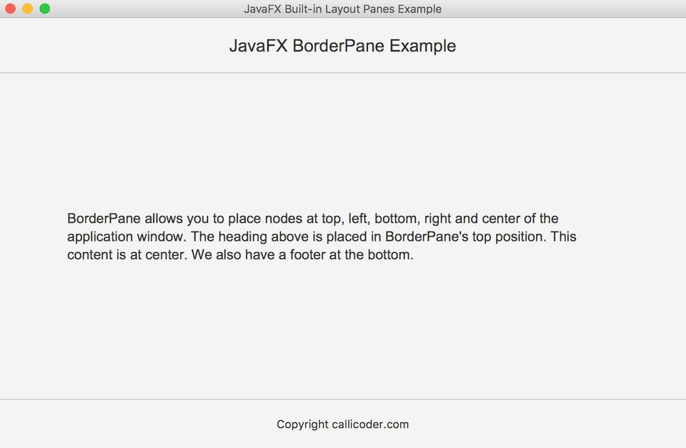
BorderPane layout allows you to position ui elements at the top, bottom, left, right and center of the screen.
In the following example, we’ve positioned three Labels in the top, center and bottom positions -
<?import javafx.scene.layout.BorderPane?>
<?import javafx.scene.control.Label?>
<?import javafx.scene.text.Font?>
<?import javafx.geometry.Insets?>
<BorderPane xmlns:fx="http://javafx.com/fxml">
    <top>
        <Label maxWidth="Infinity" alignment="TOP_CENTER"
               style="-fx-border-color: #C8C8C8;
               -fx-border-width: 0 0 1 0;
               -fx-border-style: solid">
            <text>JavaFX BorderPane Example</text>
            <font>
                <Font name="Arial" size="20">
                </Font>
            </font>
            <padding>
                <Insets top="20" left="20" bottom="20" right="20"></Insets>
            </padding>
        </Label>
    </top>
    <center>
        <Label maxWidth="Infinity" alignment="CENTER" style="-fx-wrap-text: true">
            <text>
               BorderPane allows you to place nodes at the top, left, bottom, right,
                and center of the application window. The heading above is placed
                in BorderPane's top position. This content is at center. We also
                have a footer at the bottom.
            </text>
            <font>
                <Font name="Arial" size="16">
                </Font>
            </font>
            <padding>
                <Insets top="20" left="80" bottom="20" right="80"></Insets>
            </padding>
        </Label>
    </center>
    <bottom>
        <Label maxWidth="Infinity" alignment="BOTTOM_CENTER"
               style="-fx-border-color: #C8C8C8;
               -fx-border-width: 1 0 0 0;
               -fx-border-style: solid">
            <text>Copyright callicoder.com</text>
            <padding>
                <Insets top="20" left="20" bottom="20" right="20"></Insets>
            </padding>
        </Label>
    </bottom>
</BorderPane>
Save this layout.xml file in the same directory where the main application class resides and then run the application. Following is a screenshot of our borderpane layout application -
HBox Layout
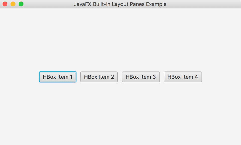
HBox layout allows you to position multiple ui nodes in a single row. In the following example, we have created four buttons inside an HBox layout -
<?import javafx.scene.layout.HBox?>
<?import javafx.geometry.Insets?>
<?import javafx.scene.control.Button?>
<HBox xmlns:fx="http://javafx.com/fxml"
      alignment="center" spacing="10">
    <padding>
        <Insets top="20" left="40" bottom="20" right="40"></Insets>
    </padding>
    <Button>
        HBox Item 1
    </Button>
    <Button>
        HBox Item 2
    </Button>
    <Button>
        HBox Item 3
    </Button>
    <Button>
        HBox Item 4
    </Button>
</HBox>
Here is a screenshot of our HBox layout pane -
VBox Layout
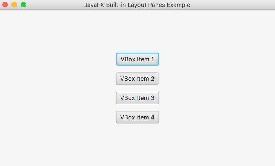
VBox layout allows you to position ui elements in a single column. Checkout the following xml file and screenshot where we have defined a simple VBox layout with four buttons inside it -
<?import javafx.geometry.Insets?>
<?import javafx.scene.control.Button?>
<?import javafx.scene.layout.VBox?>

<VBox xmlns:fx="http://javafx.com/fxml" alignment="center"
    spacing="15">
    <padding>
        <Insets top="40" left="40" bottom="40" right="40"></Insets>
    </padding>
    <Button>VBox Item 1</Button>
    <Button>VBox Item 2</Button>
    <Button>VBox Item 3</Button>
    <Button>VBox Item 4</Button>
</VBox>
GridPane Layout
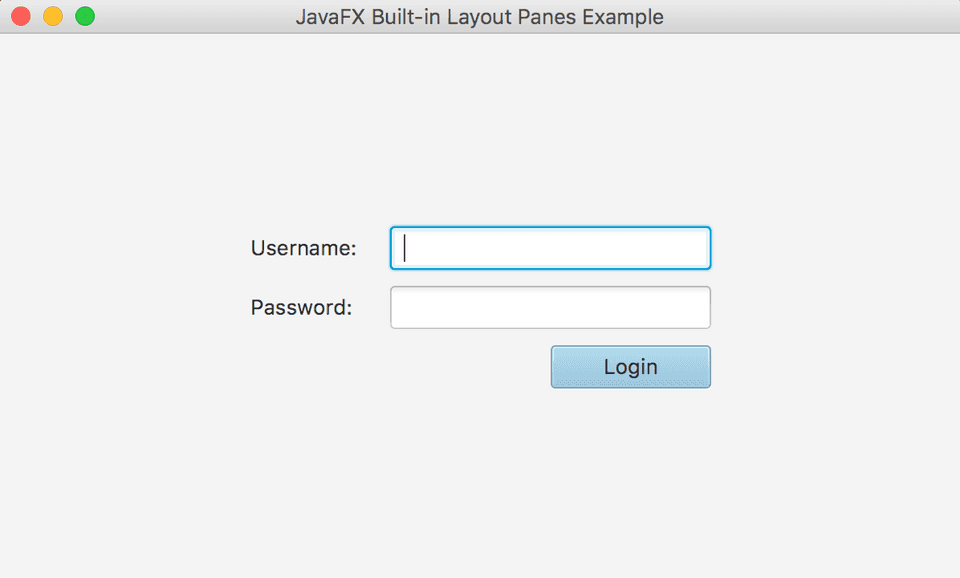
GridPane layout lets you position ui nodes in a grid of rows and columns. You just have to specify rowIndex, columnIndex properties and the ui node will be placed in that particular cell.
GridPane also has rowSpan and colSpan properties. These properties allow you to make a ui-node span multiple rows or columns.
Following is an example of a simple login form built using GridPane layout -
<?import javafx.scene.layout.GridPane?>
<?import javafx.scene.control.Label?>
<?import javafx.scene.control.TextField?>
<?import javafx.scene.control.PasswordField?>
<?import javafx.scene.control.Button?>
<?import javafx.scene.layout.HBox?>
<GridPane xmlns:fx="http://javafx.com/fxml" alignment="CENTER" hgap="20" vgap="10">
    <Label GridPane.rowIndex="0" GridPane.columnIndex="0">
        Username:
    </Label>
    <TextField prefWidth="200" GridPane.rowIndex="0"
               GridPane.columnIndex="1">
    </TextField>

    <Label GridPane.rowIndex="1" GridPane.columnIndex="0">
        Password:
    </Label>
    <PasswordField prefWidth="200" GridPane.rowIndex="1"
                   GridPane.columnIndex="1">
    </PasswordField>

    <HBox alignment="BOTTOM_RIGHT" GridPane.rowIndex="2"
          GridPane.columnIndex="0" GridPane.columnSpan="2">
        <children>
            <Button prefWidth="100" defaultButton="true"
                    text="Login" alignment="CENTER"></Button>
        </children>
    </HBox>
</GridPane>
StackPane Layout
The StackPane layout places all the ui nodes within a single stack.
When you add a new node to the StackPane layout, It will be placed on top of any previously added node.
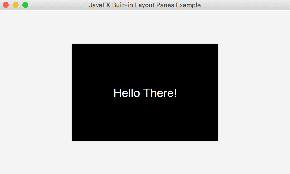
In the following example, I’ve added a rectangle and a label to the StackPane layout. The layout will simply place the label on top of the rectangle.
<?import javafx.scene.layout.StackPane?>
<?import javafx.scene.shape.Rectangle?>
<?import javafx.scene.control.Label?>
<?import javafx.scene.text.Font?>
<StackPane xmlns:fx="http://javafx.com/fxml">
    <Rectangle width="300" height="200" fill="black">
    </Rectangle>
    <Label>
        <text>Hello There!</text>
        <textFill>white</textFill>
        <font>
            <Font name="Arial" size="24"></Font>
        </font>
    </Label>
</StackPane>
Conclusion
In this tutorial, we learned about common javafx layout panes and how to use them with simple examples.
You can find all the code snippets used in this tutorial in my github repository.
Also, Don’t forget to checkout my next blog post where I’ll show you how to use CSS for styling your layouts.
Thank you for reading. Please feel free to ask any questions in the comment section below.

